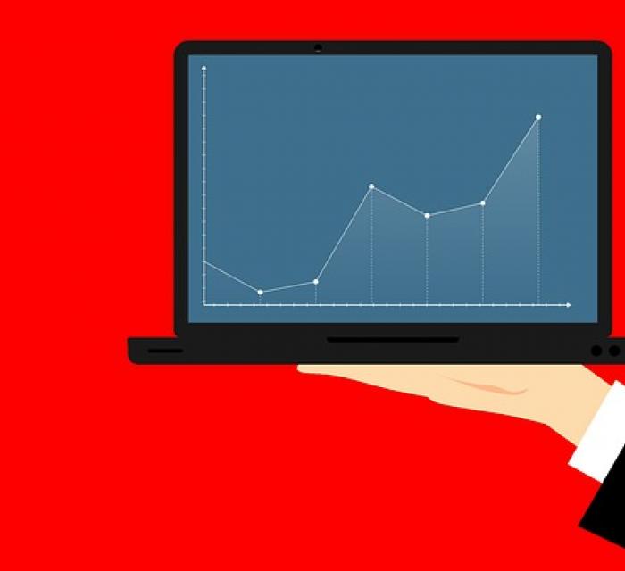
Dashboard and various data sources for your management reporting
A dashboard is an information tool that displays the evolution of key performance indicators to monitor and analyze the “health” of a business, department or process. The dashboard is connect to the source data and displays it in the form of well-arranged tables and graphs. When designing management reporting and dashboards, it is necessary to take into account the individual needs of both a particular user and particular company or industry. Depending on these needs, the dashboards can be a superstructure of a detailed management report or a standalone tool.
In general, the higher is the position of the report/dashboard user within company, the more aggregated the data he needs to see. For top managers and business owners, the dashboard can by the most interesting part of the report and they do not follow detailed data on a regular basis. On the contrary, middle-level managers are interested in much more detailed data in addition to strongly aggregated information – they need to see deeper detail in order to find out how their entrusted department, company process, customer or product works. More detailed information are used to effectively influence the functioning of the area they are in charge of.
Regardless of the sectoral focus or the difficulty of the industry in which the company operates, appropriate management reporting should combine:
- Financial data and indicators, where the main source is correct and timely accounting,
- Natural indicators, where the source is mainly auxiliary modules of company system – for example information from stock management, production module, shipping, HR module and so.
In some sectors (mainly services or simple manufacturing) it may be sufficient to monitor only the company’s basic financial indicators in the dashboard. On the other hand, the more demanding the industry is in terms of input, output, customers, regions and so on – more is growing the importance in monitoring not only financial results, but also natural or other indicators. Examples of non-financial indicators are:
- physical volume of consumption of the raw material or components,
- number of products produced,
- volume of products dispatches,
- Number of employees,
- time utilization of production capacities,
- number of customers, for example by geographic structure,
- the number of registered regularly paying customers for a particular service,
- share of claims, percentage indicators of customers satisfaction rate etc.
combining physical indicators with financial brings another dimension to the dashboard to the basic, financial. This provides a better understanding of how a company’s financial performance is conditional on real activity and, consequently, more efficiently manage the business and achieving financial plans. Incorporating non-financial indicators into the dashboard can not only improve the understanding of your own business over time, but also allow you to more accurately compare your business with your competitors because of monitoring the primary parameters that then translate into financial results. Thanks to such non-financial benchmarking, it is easier to discover advantage and where its reserves are.
The primary motivation in designing the dashboard structure is its maximum usefulness. Usefulness goes hand in hand with a friendly visual concept. However, a dashboard is not just a visually intrinsic creation. The graphic processing pursues the purpose of clarity, meaning that the appropriate graphics clearly emphasize that the graphs and tables in the dashboard are result of a large variety of diverse data. The user can clearly distinguish what each item represents and easily navigate even in highly concentrated data for the entire business. Usually, on a single sheet of A4, the dashboard gives the user all the necessary information, structured in an easy-to-read form.
Finally, one important remark. Correct compilation of the report itself and its technical preparation is only one side of the coin. The other side of the coin is the correct interpretation and analysis of trends and good advice on how to deal with the situation. Each report is useful only if it contains the correct interpretation of the development and suggestion of possible solutions. With this expectation that you can turn to VGD as your consultant and advisor in areas of business consulting.
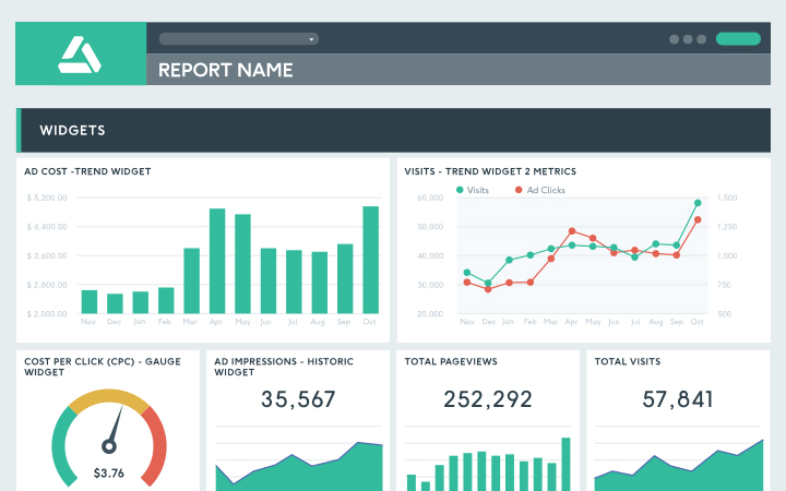
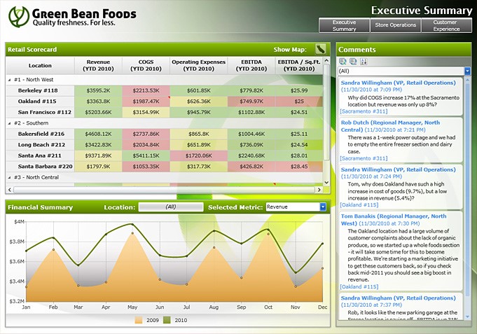
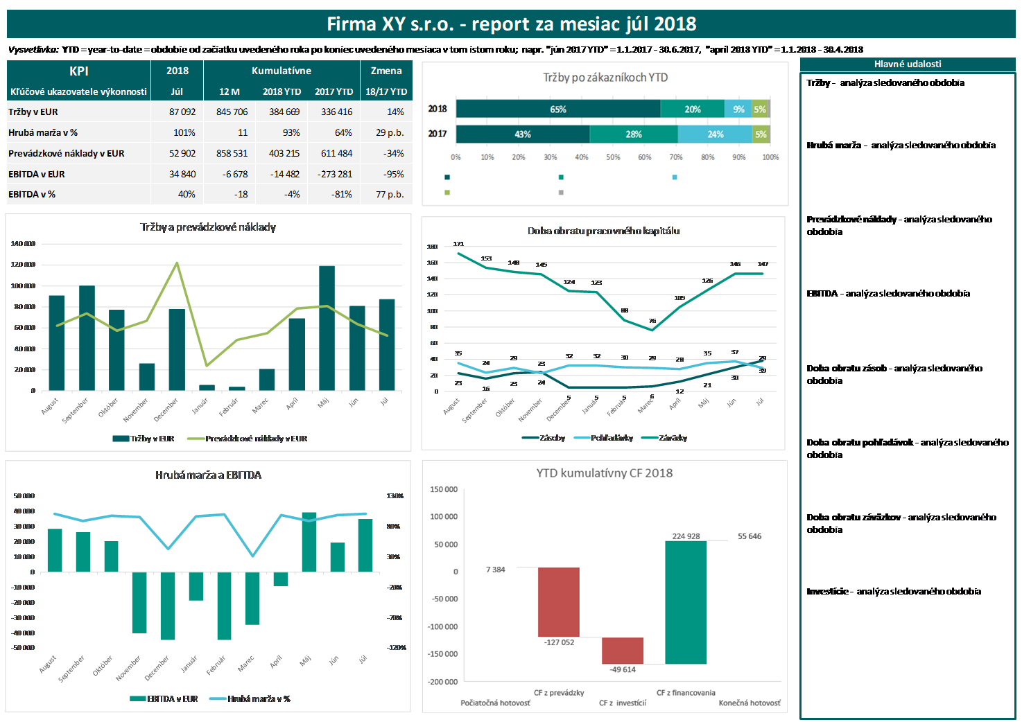
Below are 3 examples of what a so-called “look” can look like. Dashboard report + at the end also our own report, which we like to use for our clients:
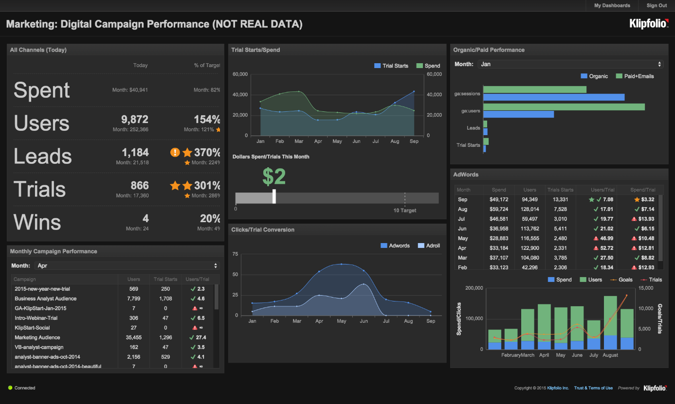
At the end, our own template with our corporate colors:
If this article convinced you that a dashboard is what your business needs, feel free to visit our website https://sk.vgd.eu/sluzby/business-advisory-services or facebook page for more information. We are ready to share our knowledge and experience with you.
Are you interested in manager report?